React Motion Animation Library - Advanced Framer Motion Showcase
Comprehensive demonstration of Framer Motion for creating stunning, performant animations in React applications with parallax effects and interactive UI components.
React Motion Animation Library
🎬 Live Demo: Experience Advanced Animations
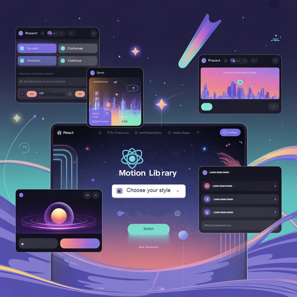
📸 Project Preview

🚀 Quick Links
- 🎬 Live Demo - Experience the animations
- 💻 GitHub Repository - Explore the source code
- 📚 Framer Motion Docs - Official documentation
📋 Table of Contents
- 🚀 Project Overview
- ✨ Core Features
- 🎯 Framer Motion Implementation
- 🎨 CSS & Styling System
- 🏗️ Component Architecture
- ⚡ Performance Optimization
- 🛠️ Getting Started
🚀 Project Overview
React Motion Animation Library is a comprehensive demonstration project showcasing the powerful capabilities of Framer Motion for creating stunning, performant animations in React applications. This project serves as a practical example of how to implement complex animations, parallax effects, and interactive UI components using modern web technologies.
The application demonstrates professional animation patterns, particle systems, and gesture-based interactions in a visually captivating cosmic-themed interface.
✨ Core Features
🎯 Advanced Animation Techniques
- Parallax Scrolling Effects - Multi-layered animations with depth perception
- Complex Particle Systems - Cosmic background with animated stars and effects
- Gesture Animations - Hover, tap, and scroll interactions with smooth feedback
- Page Transitions - Seamless navigation with animated transitions
🎨 Visual Design
- Cosmic Theme - Space-inspired color scheme with deep blues and purples
- Glass Morphism - Modern UI with backdrop blur and transparency effects
- Neon Accents - Bright highlights against dark backgrounds
- Layered Design - Depth and dimension with shadows and blurs
⚡ Performance Features
- Hardware Acceleration - Optimized animations using
transform3d - Reduced Motion Support - Respects user accessibility preferences
- Mobile Optimization - Simplified animations for touch devices
🛠️ Tech Stack
Core Framework
- React 18 - Latest React with concurrent features
- Framer Motion 10 - Production-ready animation library
Styling & UI
- CSS Custom Properties - Comprehensive design token system
- Advanced CSS - Backdrop filters, complex gradients, custom scrollbars
- Responsive Design - Mobile-first approach with Tailwind-like utilities
Development Tools
- Vite - Fast build tool and development server
- ESLint & Prettier - Code quality and formatting
🎯 Framer Motion Implementation
Core Hooks Used
useScroll Hook
Creates depth by moving background and foreground elements at different speeds during scroll. Implements spring-physics based scroll tracking for natural motion.
useTransform Hook
Transforms scroll progress into various animation values (position, scale, rotation, opacity). Different elements use custom mapping functions for unique motion curves.
useAnimate Hook
Provides programmatic control over animation sequences. Used for form validation feedback with shake and highlight effects for invalid form inputs.
AnimatePresence Component
Enables smooth component unmounting with custom transitions. Manages proper animation sequencing for modal open/close states and list management.
Animation Patterns Implemented
Layout Animations
- Automatic layout adjustments when elements are added/removed
- Shared layout transitions between related components
- Animated tab indicators that follow selected tabs
Gesture Animations
- Scale and elevation changes on mouseover
- Press-down animations for buttons and interactive elements
- Simulated dragging through scroll-based transformations
Staggered Animations
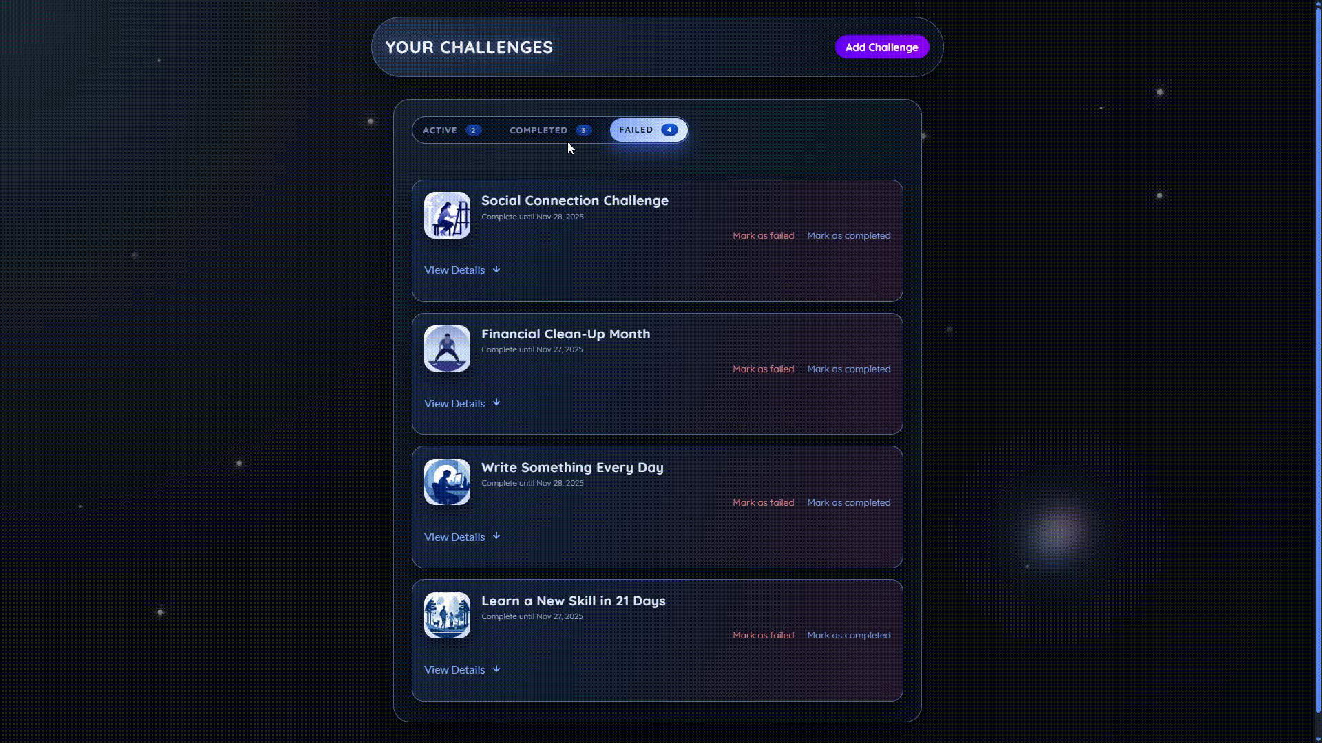
- Challenge items animate in with cascading delays
- Form elements appear with sequential animation
- Text and sections appear with orchestrated timing
🎨 CSS & Styling System
Custom Properties & Design Tokens
The project uses a comprehensive CSS custom properties system for consistent theming:
css:root { /* Color Palette - Cosmic theme */ --bg-body: radial-gradient( circle at top left, #1b2735 0%, #090a0f 40%, #050810 100% ); --bg-card: rgba(19, 28, 43, 0.92); --text-main: #e4ecff; --text-muted: #9aa8c3; /* Spacing System */ --radius-lg: 18px; --radius-md: 12px; --radius-sm: 8px; /* Animation Timing */ --transition-fast: 0.2s ease-out; --transition-med: 0.35s cubic-bezier(0.22, 0.61, 0.36, 1); }
Advanced CSS Features
- Backdrop Filters: Glass morphism effects with blur and transparency
- CSS Grid & Flexbox: Responsive layout systems
- Complex Gradients: Multi-layered radial and linear gradients
- Custom Scrollbars: Themed scrollbars matching the cosmic design
Particle System
The background features a sophisticated particle system with:
- Multiple Particle Types: Regular stars, shooting stars, orbital particles, and special effects
- Layered Animation: Combined float, twinkle, and color shift animations
- Performance Optimized: Hardware acceleration and reduced motion support
- Responsive Design: Particle density adjusts based on screen size
Example particle animation:
css.particle { animation: particleFloat 26s linear infinite, particleTwinkle 4s ease-in-out infinite alternate, particleHueShift 16s ease-in-out infinite alternate; } @keyframes particleFloat { 0% { transform: translate3d(0, 0, 0) scale(1); opacity: 0; } 10% { opacity: 0.7; } 100% { transform: translate3d(-12px, -280px, 0) scale(0.93); opacity: 0; } }
🏗️ Component Architecture
Page Components
- Welcome Page: Hero section with parallax cityscape and animated character
- Challenges Page: Interactive challenge management with tabbed interface
Reusable Components
ChallengeItem Component
Expandable cards with smooth height transitions using Framer Motion:
jsximport { AnimatePresence, motion } from "framer-motion"; export default function ChallengeItem({ challenge, isExpanded }) { return ( <motion.li layout exit={{ y: -30, opacity: 0 }}> <AnimatePresence> {isExpanded && ( <motion.div initial={{ height: 0, opacity: 0 }} animate={{ height: "auto", opacity: 1 }} exit={{ height: 0, opacity: 0 }}> <p className="challenge-item-description"> {challenge.description} </p> </motion.div> )} </AnimatePresence> </motion.li> ); }
Challenges Component
Staggered list animations with container variants:
jsxconst listVariants = { hidden: { opacity: 0, y: 15, scale: 0.98 }, visible: { opacity: 1, y: 0, scale: 1, transition: { duration: 0.35, ease: "easeOut", when: "beforeChildren", staggerChildren: 0.06, }, }, exit: { opacity: 0, y: -15, scale: 0.98, transition: { duration: 0.25, ease: "easeIn" }, }, }; export default function Challenges() { return ( <motion.ol className="challenge-items" variants={listVariants} initial="hidden" animate="visible" exit="exit"> {/* Challenge items with staggered animation */} </motion.ol> ); }
Header Component
Interactive header with animated buttons:
jsxexport default function Header() { return ( <header id="main-header"> <motion.h1 onClick={() => navigate("/")} initial={{ opacity: 0, y: -20 }} animate={{ opacity: 1, y: 0 }} whileHover={{ scale: 1.05 }} whileTap={{ scale: 0.95 }} transition={{ type: "spring", stiffness: 300, damping: 20, }}> Your Challenges </motion.h1> <motion.button whileHover={{ scale: 1.05 }} whileTap={{ scale: 0.97 }} transition={{ type: "spring", stiffness: 400, damping: 25, }}> Add Challenge </motion.button> </header> ); }
Badge Component
Simple badge with scale animation:
jsximport { motion } from "framer-motion"; export default function Badge({ caption }) { return ( <motion.span animate={{ scale: [1, 1.2, 1] }} transition={{ duration: 0.3 }} className="badge"> {caption} </motion.span> ); }
State Management
- React Context: Global state for challenges and UI state
- Local State: Component-specific animation states and UI interactions
Context implementation:
jsximport { createContext, useState } from "react"; export const ChallengesContext = createContext({ challenges: [], addChallenge: () => {}, updateChallengeStatus: () => {}, }); export default function ChallengesContextProvider({ children }) { const [challenges, setChallenges] = useState([]); function addChallenge(challenge) { setChallenges((prevChallenges) => [ { ...challenge, id: Math.random().toString(), status: "active" }, ...prevChallenges, ]); } // ... other state management functions }
⚡ Performance Optimization
Hardware Acceleration
css.optimized-element { transform: translate3d(0, 0, 0); will-change: transform, opacity; backface-visibility: hidden; }
Reduced Motion Support
css@media (prefers-reduced-motion: reduce) { .animated-element { animation-duration: 0.01ms !important; animation-iteration-count: 1 !important; transition-duration: 0.01ms !important; } }
Mobile Optimization
css@media (max-width: 768px) { .animated-section { backdrop-filter: blur(15px); transform: none; /* Remove 3D transforms on mobile */ } .animated-section:hover { transform: translateY(-4px) scale(1.005); } /* Reduce particle count on mobile */ .particle { display: none; } }
Efficient Re-renders
- Proper dependency management for animations
- Component-level animation states
- Memoized animation configurations
🎭 Visual Features
Cosmic Design Theme
- Space-inspired Color Scheme: Deep blues, purples, and cosmic gradients
- Neon Accents: Bright highlights against dark backgrounds
- Depth and Dimension: Layered elements with shadows and blurs
Interactive Elements
- Animated Buttons: Gradient shifts and scale transformations
- Form Interactions: Validation feedback with motion
- Tab Transitions: Smooth indicator movements and content swaps
Glass Morphism Effects
Modern UI with backdrop filters:
css.glass-card { background: rgba(26, 26, 74, 0.3); backdrop-filter: blur(20px) saturate(180%); border: 1px solid rgba(255, 255, 255, 0.1); border-radius: var(--radius-lg); box-shadow: var(--shadow-lg); transition: all 0.3s var(--ease-out); }
Key Animation Patterns to Study
- Parallax Scrolling: Multi-layer animations based on scroll position
- Staggered Animations: Sequential animation of list items
- Layout Animations: Smooth repositioning of elements
- Gesture Animations: Interactive hover and tap effects
- Particle Systems: Complex background animations
📚 Learning Outcomes
Framer Motion Mastery
- useScroll & useTransform: Parallax effects and scroll-based animations
- AnimatePresence: Component exit animations and modal management
- Layout Animations: Automatic layout adjustments and transitions
- Gesture Animations: Interactive hover, tap, and scroll effects
Performance Optimization
- Hardware Acceleration: Optimized animations using transform3d
- Reduced Motion: Accessibility considerations for animation preferences
- Mobile Optimization: Simplified animations for touch devices
- Efficient Re-renders: Proper dependency management
Advanced CSS Techniques
- CSS Custom Properties: Comprehensive design token system
- Glass Morphism: Modern UI with backdrop filters
- Complex Gradients: Multi-layered visual effects
- Particle Systems: Animated backgrounds with performance optimization
Component Architecture
- Reusable Animation Components: Modular animation patterns
- State Management: Context API for global animation states
- Responsive Design: Adaptive animations across screen sizes
- Accessibility: Reduced motion support and focus management
🤝 Contributing
This project serves as both a production implementation and a learning resource for advanced Framer Motion techniques.
Development Guidelines
- Follow existing animation patterns and code structure
- Add comprehensive examples for new animation techniques
- Include performance considerations in implementations
- Ensure accessibility compliance for all animations
- Document new features with practical examples
Areas for Enhancement
- New Animation Types: 3D transforms, morphing animations, shader effects
- Additional Gestures: Pinch, rotate, long-press interactions
- Performance Improvements: WebGL integration, canvas-based animations
- Accessibility Features: Screen reader support, keyboard navigation
- Testing Strategies: Animation testing tools and methodologies
🎬 Ready to create stunning animations with Framer Motion?